This week in class we discussed advert layouts, taglines, logo's, target market and I made a practice advert using Pixlr as shown in my previous post. We thought about what we might want to advertise and I was thinking about advertising one of the following:
Luxury watches.
Wedding/engagement jewelry.
A warhammer tournament.
The first luxury watch advert that stood out to me was the one pictured above for the Rolex Day-Date watch. It immediately shows that this watch is made for important people, this is shown through both the photo, with the microphones surrounding the person showing that people want to hear what they are speaking about, and the tagline indicating that people who wear a rolex will change the world. The tagline states that the watch is not that special, but the person who is wearing it is. This already makes the person interested in buying this watch feel like if they do not have it, they will not change the world or be important and people like feeling important. The person in the photo is of an older age and a Rolex watch can be very expensive, which makes me believe that this advert's target audience is Baby Boomers.

This advert stood out to me because of the contrast in the black and white photo, however when I read the tagline I lost some interest. The advert itself is very simple, the focus is laid on the watch by the woman's hand touching it. The man is wearing a suit and holding a wine glass, things that are usually associated with a luxurious lifestyle or events. The tagline insinuates that the man wearing this watch will be able to go underwater with it, or they will gain attention from women. This advert is clearly made for men, even if they do not seek to swim with their watch.
My next idea was wedding or engagement jewelry, below are some adverts I found on this topic.
I can imagine why this advert would attract someone that is looking to get their partner an engagement ring, the advert shows that the ring is well crafted through the photo of the man looking at the diamond through a magnifying loop and thoroughly inspecting it as well as through the short and easy to understand text stating how good the quality of the diamond is. Without much experience and thought someone would look at this and trust that this ring must be good, not to mention that Tiffany & Co is a well established brand.

I think the tagline of this advert is really clever; ‘Make two months’ salary last forever.’. It encourages the consumer to spend more money and see their purchase as a more than a lifetime investment, since investing in something is usually seen as more positive than simply buying something. In addition this campaign allows the consumer to design their own ring, claiming that they can make ‘the engagement ring of your dreams’. It allows the consumer to give their partner something unique, that will supposedly last forever. The advert itself is simple and uses contrasting colours to attract to the logo, the text and the shiny engagement ring. Again, the text is easy to understand and does not overstay its welcome by being too long.
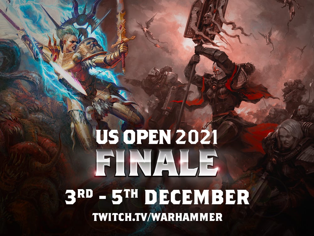
The big and bold text on this advert immediately tells the viewer everything they need to know about this event; what it is, when it is and where to watch it. The art of two armies fighting each other in the background emphasizes that the advert is for a tournament of people using their armies to compete with each other. The only thing that I think is missing is the original Warhammer logo, it is only mentioned in the link at the bottom in a text format. It would have been easier to understand the context of the tournament if the original logo had been added.
Now that I have looked at some existing adverts, it is time to choose my own idea and develop it further. My previous practice advert was quite simple, so for my next advert I want to do something bold. I have chosen to go with the idea to make an advert for a Warhammer tournament, so I can practice with bold fonts, busy backgrounds and how to combine the two to still have a readable end result. For my advert I will have to add a location, date and time, what it is and I want to include the original Warhammer logo as well as the venue logo that I will design myself.
I started off with designing the logo for my venue. I used the same free online logo designer that I used in my previous post and called my venue ‘Tabletop Arena’.
Next I looked at the art I wanted to use for my advert and I found the following:

Necrons Art of 40K (2022)
I decided to go with the second artwork as it had more action going on than the other two and I wanted my advert to look exciting. I opened the image in Pixlr to see if I could create some more space above it, I then clicked 'Create New' and 'Print' to create an A3 canvas with a black background as I have described in my previous Pixlr post. I used 'Select All' in the Select menu at the top and then used 'Copy' and 'Paste' in the top menu to copy and paste the image to my canvas.

To smoothen the edge between the background and the image I used the 'Gradient' tool in the left hand menu, I then clicked on 'Gradient' in the gradient menu that popped up at the top and chose the fifth option in the gradient styles that were offered to me, in the same menu I clicked on both arrow icons either side and chose 'Colour' to change the colour to black. Then I dragged my mouse downwards over the canvas multiple times to create my desired gradient.

Then it was time to add the text, I created a new textbox on my canvas by using the 'Text' tool from the menu on the left and dragged my mouse across my canvas. I changed the text by double clicking the textbox and typing my title. I wanted to use a bold but readable font, so in the 'Font' option in the text menu I chose the font 'Oracles' and changed the size to 280 in the 'Size' option in the same menu. In the 'Fill' option I chose to make my text white, since black and white contrast each other and it will make the white text pop out more. I then moved the textbox to the top of my canvas using the 'Arrange' tool.
I created another textbox with the font 'Menighampiil', as I wanted the subtext to appear thinner and smaller. I changed the font size to 155 and arranged it to the center. After this I added my logo using the same copy and paste method as before and arranged it to the center as well. I opted out of using the original Warhammer logo due to possible copyright issues.

I was satisfied with how my advert turned out and so I went to 'File' in the top menu and chose 'Export' to 'Quick export as PNG' and save it to my device.


Comments
Post a Comment